How to build a Video Preview Feature ▶️
Viktor Ahmeti.2 years ago
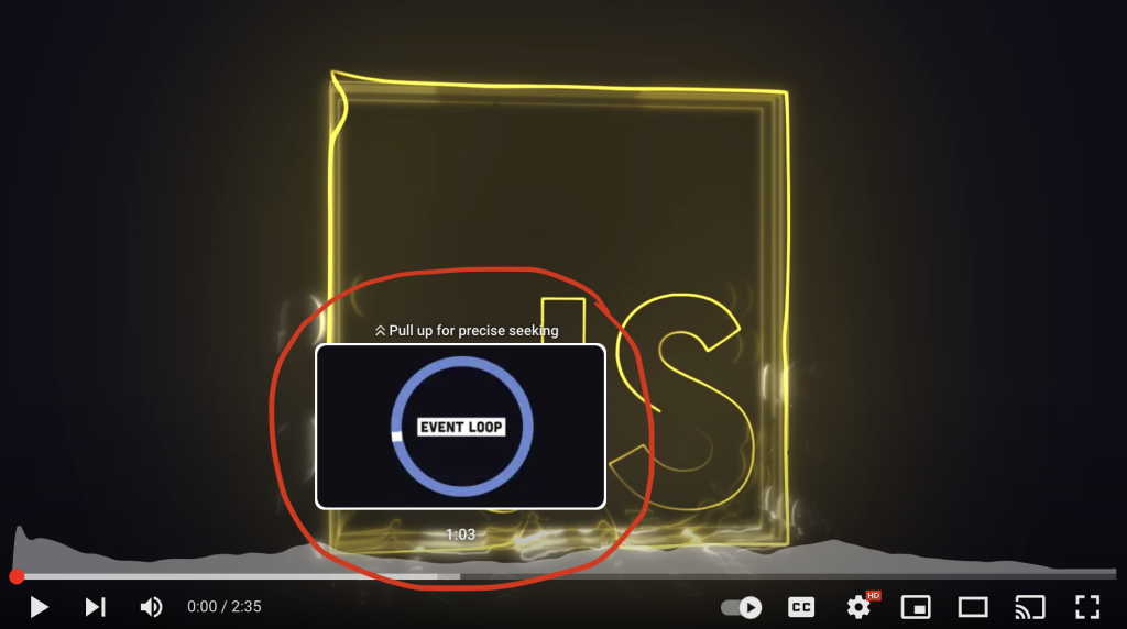
During the year 2021, while I was working as a JavaScript Developer at Gjirafa, I had the opportunity to work on a legit Video Player. A cool feature on the Player was to scroll or hover on the progress bar and see a tiny preview of the video at that point, like below:

In this post we will recreate the frontend part of this feature using HTML, CSS, and JavaScript. We will see that the main functionality will be achieved by using the CSS background-position property. The final result should look something like this:
How to approach the problem?
All the code from this post can be found on the Github Repository and you can play with the implementation here. You can follow along with the code in this post and you’ll have a functional Filmstrip by the time we finish.
Before we dive into the code let’s take some time to think about how we will solve the problem. If you go and open a video at video.gjirafa.com and analyze the Network Requests you will find an asset called filmstrip0.jpg or filmstrip1.jpg. This asset is an image with fixed dimensions 1600×900 and it contains 10 rows and 10 columns with small 160×90 images. A Filmstrip taken from a TV Show from the site looks like this:

We will suppose that an asset like the one above is provided to us because it is generated on the backend when the video is uploaded, with tools like FFMPEG. Furthermore, we will suppose that our Filmstrip frame has proportions 16:9.
You may ask why an asset like the one above exists in the first place? The reason is that we don’t want to load the whole video if we’re not sure the user will watch the whole thing. This saves money on the server, saves the user’s bandwidth, and offers a faster experience on the frontend 🚀.
It’s clear that we don’t need a video at all to create this functionality, so we will simply create a slider which displays one of the sub-images depending on the progress (from 0% to 100%). Let’s start!
Writing the HTML and CSS
A slider can be created very easily by using the <input type="range"> element introduced in HTML5. Because it’s hard to style and customize this element, we will simply recreate it with the HTML structure below:
<div class="slider-wrapper" id="slider">
    <div class="slider-progress" id="slider-progress">
    </div>
    <span class="slider-knob" id="slider-knob"></span>
</div>
The slider-wrapper represents the whole slider which inside contains the progress (the percentage of the video that has played until now) and the knob which we drag with a mouse or touch. The wrapper can be styled easily:
.slider-wrapper{
    width: min(500px, 100%);
    position: relative;
    height: 5px;
    background-color: grey;
    cursor: pointer;
    margin-inline: auto;
}
The property position: relative is necessary because we will position the children absolutely. The progress starts on the left and initially has a width of 0 which will increase in the future:
.slider-progress{
    position: absolute;
    top: 0;
    left: 0;
    bottom: 0;
    width: 0;
    background-color: #f00;
}
Finally we style the knob to which we give a fixed but easily customizable size while also giving it a simple hover effect:
.slider-knob{
    width: 16px;
    height: 16px;
    background-color: #f00;
    border-radius: 50%;
    position: absolute;
    top: -6px;
    left: -8px;
    cursor: pointer;
    transition: scale .2s ease;
}

.slider-knob:hover{
    scale: 1.1;
}
Notice that we used border-radius: 50% to make the knob circular and the modern property scale to size up the element (optionally we could use transform: scale(1.1)). With that, we get a slider that looks like below:
How to get the slider working?
Now we need to make the slider move when we drag it with a mouse or touch. To achieve this, we will incorporate JavaScript and use the mousedown, mousemove, and mouseup events. Later we will also use touchstart, touchmove, and touchend to make the slider work on touch-based devices.
Let’s create 3 functions called dragInit, dragMove, and dragEnd which are called when the above functions occur:
function dragInit(e){
    //register the functions for when the mouse moves and stops
    document.onmouseup = dragStop;
    document.onmousemove = dragMove;
}

function dragMove(e){
  //code that makes the changes in the UI
}

function dragStop(e){
    //unregister the functions
    document.onmousemove = null;
    document.onmouseup = null;
}

//register the function when the dragging starts
let knob = document.getElementById('progress-knob');
knob.onmousedown = dragInit;
The above code is a common pattern to handle dragging. It would be better to use the more modern addEventListener function but we will override the functions just for demonstration.
The goal now is to change the CSS width property of the progress and the CSS left property of the knob. The main information we need to extract is the length of the progress depending on the position of the mouse. The helper function below achieves this:
let slider = document.getElementById('slider');

//the input parameter is the X coordinate of the mouse
function getProgressWidth(mouseX){
    return Math.max(0, Math.min(mouseX - slider.getBoundingClientRect().left, slider.getBoundingClientRect().width));
}
Notice that the way we calculate the length is similar to how the clamp property in CSS works. Let us now create the main updateProgress function which accepts the X coordinate of the mouse as a parameter and it then makes the changes in the UI:
//Global variable where we store the current percentage 0-100
let currentPercentage;

function updateProgress(mouseX){
    //calculating the percentage as the ratio between the progress and the slider length
    currentPercentage = getProgressWidth(mouseX) /
                        slider.getBoundingClientRect().width * 100;

    updateKnobPosition(currentPercentage);
    updateProgressPosition(currentPercentage);
}
All that remains now is to implement the functions that change the progress length and the knob position:
function updateKnobPosition(percentage){
    knob.style.left = `calc(${percentage}% - ${knob.getBoundingClientRect().width / 2}px)`;
}

function updateProgressPosition(percentage){
    progress.style.width = `${percentage}%`;
}
In the updateKnobPosition function we use the CSS calc function to subtract half the width of the knob so it looks better. Now all that remains is calling updateProgress from the dragMove function so we have a working slider on devices with pointers (but not on mobile phones):
function dragMove(e){
    updateProgress(e.clientX);
}
Making the Filmstrip work
There are two main things to do to make a working Filmstrip. The first is to create a frame that moves through the screen according to the progress. The second is to alter the background image of the frame to show the correct image. But first, HTML:
<div class="slider-wrapper" id="slider">
    <div class="slider-progress" id="slider-progress">
    </div>
    <span class="slider-knob" id="slider-knob"></span>
    <div class="filmstrip" id="filmstrip"></div>
</div>
Now we do basic CSS styling. We’ll use the modern aspect-ratio property to maintain the 16:9 aspect ratio but you can also do it by hard-coding the height or using the padding-bottom trick:
.filmstrip{
    width: 160px;
    /* height: 90px; */
    aspect-ratio: 16 / 9;
    position: absolute;
    bottom: 15px;
    left: 0;
    visibility: hidden;
    pointer-events: none;
    background-image: url(filmstrip.jpg);
    box-shadow: 1px 1px 1px grey;
}
The Filmstrip is initially invisible and doesn’t accept mouse clicks, and the background image is the asset that was shown at the beginning of this post. A helper class .show will make the Filmstrip visible when we need it to:
.filmstrip.show{
    visibility: visible;
}
Of course we could add some fancy animation but we’ll keep things simple. We’ll call a updateFilmstrip function inside updateProgress which shows the Filmstrip:
function updateProgress(mouseX){
    //...
    updateFilmstrip(currentPercentage);
}
All that remains now is to implement updateFilmstrip which should change the position of the Filmstrip depending on the progress:
let filmstrip = document.getElementById('filmstrip');

function updateFilmstrip(percentage){
    let progressWidth = progress.getBoundingClientRect().width;

    //We consider the cases when the filmstrip sticks to the left or right of the slider
    if(progressWidth <= filmstrip.getBoundingClientRect().width / 2){
        filmstrip.style.left = `calc(${percentage}% - ${progressWidth}px)`;
    }
    else if(slider.getBoundingClientRect().width - progressWidth <= filmstrip.getBoundingClientRect().width / 2){
        filmstrip.style.left = `calc(${percentage}% - ${progressWidth + filmstrip.getBoundingClientRect().width - slider.getBoundingClientRect().width}px)`;
    }
    else{
        filmstrip.style.left = `calc(${percentage}% - ${filmstrip.getBoundingClientRect().width / 2}px)`;
    }

    //show the filmstrip
    filmstrip.classList.add('show');
}
That’s enough to make the filmstrip show and move with the progress. At last we alter the background of the Filmstrip. We can do this in 3 steps:
- We set the size of the background with
background-size - We set the X position of the background with
background-position-x - We set the Y position of the background with
background-position-y
Since the filmstrip image has 10 rows and 10 columns, the size of the background should be 10 times bigger than the size of the Filmstrip frame:
filmstrip.style.backgroundSize = filmstrip.getBoundingClientRect().width * 10 + 'px';We continue further with the coordinates. These depend on the quotient and remainder for when the percentage is divided with the number 10. After lots of tries and reading the specification of the background-position property, we arrive at the following code:
filmstrip.style.backgroundPositionY = Math.floor(Math.floor(percentage) / 10) * filmstrip.getBoundingClientRect().height * -1 + 'px';
filmstrip.style.backgroundPositionX = (Math.floor(percentage) % 10) * filmstrip.getBoundingClientRect().width * -1 + 'px';
Add these 3 lines somewhere inside the updateFilmstrip function and everything will work properly. Don’t forget to hide the filmstrip when the dragging stops with the following function:
function hideFilmstrip(){
    setTimeout(() => filmstrip.classList.remove('show'), 0);
}
We used a setTimeout with delay 0 so all remaining queued functions in the loop finish before this one. Try the Filmstrip here or read the code in GitHub.
Conclusion
This project was a demonstration of the many things we can achieve with JavaScript in the browser. The main things that made this possible were events for listening for mouse clicks, the getBoundingClientRect() function for precise calculations, and a little CSS for the background.
The live implementation and the code on GitHub contain an improved version of this project with support for hovering, clicks, and touch-based devices.
← All blogs
